Working with masks
Masks are possibly the most powerful feature in darktable. They allow you to restrict any module (well, almost any) to apply only to certain parts of an image. Combined with the fact that you can have an arbitrary number of instances for each module, this opens up nearly endless possibilities for image editing.
The first part here covers some basic information and tips about masks, while the second part collects some practical examples that I often use masks for.
All images can be enlarged by clicking on them!
The basics
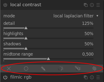
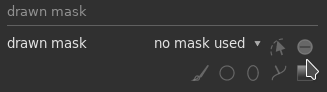
When a module is opened, the row of buttons at the very bottom of the module is for selecting the different types of masking:
Defining masks is so powerful that it's hard to exhaustively cover them. Instead, I'll try to summarize the most important tips to get started with them.
After clicking on one of the mask buttons, another tab with buttons and sliders related to masking will appear. The most important button (in my opinion) is on the very bottom of that tab. It allows you to display the mask:
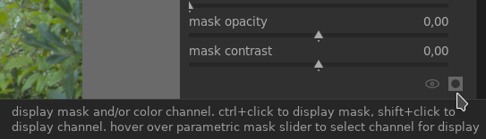
If you have not changed anything yet, clicking on this button will make the whole image turn yellow. This means that the module currently applies to all parts of the image equally. Whenever you draw a mask, or set some masking parameters, you can use this button to clearly display what parts of the image you have selected. (Clicking the button again will turn off the mask display.)
Drawn masks
For drawn masks, you have five different tools to draw the mask with:
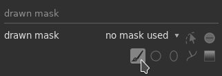
- The brush allows you to draw mask regions by hand.
- The circle tool draws circles (duh).
- The ellipse tool draws ellipses (duh²).
- The path tool allows you to place nodes along a path, which is useful e.g. for drawing masks around objects or people.
- The gradient tool draws gradients, which is useful for "fading out" a mask towards one side of the image.
For all of these tools, you need to click and/or drag on the image to actually draw the mask. Pay attention to the top of the window, where additional info about using the tool will appear. For example, here's the info when using the circle tool:
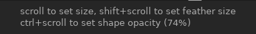
This means that scrolling with the mouse wheel will change the size of the circle, while holding the shift key and scrolling will change the size of the "feather". That's basically the outer area of the circle where it "fades out".
Remember that the "display mask" button is your best friend if you want to see how some options actually affect the mask.
Inverting a mask
By default, when you draw any kind of mask, the area that you draw is the area that the module will be applied to. In other words, when you draw a circle as a mask, the module will apply to the circled area, while the areas outside the circle are masked out.
However, there's a button to toggle the polarity of the mask, which essentially means inverting it:
Toggling this will mean that now the modules applies outside the drawn area.
Again, the "display mask" button will show you this so much more clearly. Use it, and remember that the more opaquely yellow an area is, the more the module applies to that area.
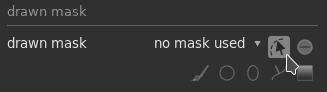
Editing existing masks
If you come back to the mask tab to edit a mask you made earlier, but you can't see it on the image, this important little button will show you the existing mask elements:
Reusing masks
Remember that masks are always drawn for one specific module that they should apply to. But what if you have multiple modules that you want to use the same mask for? Easy – use this dropdown menu:
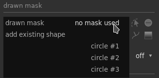
This dropdown shows all the mask shapes that you previously defined for this image, so you can easily reuse a shape for a different module's mask.
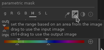
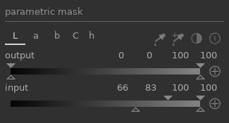
Parametric masks
For parametric masks, the interface will consist of a row of letters that you can click on to reveal different sliders:
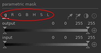
The different sliders allow you to select regions in the image based on different parameters:
- g is for the gray value
- R, G, B are for the red, green, and blue channels
- H, S, L are for hue, saturation, and luminance
This set of sliders only applies to modules that work in RGB color space. If you see sliders named "L a b C h", the module works in Lab color space instead, so the parameters work a little differently.
The output slider applies to the output of the module that's being masked, the input slider applies to its input (before applying the module). I find that I mostly want to use the input slider.
Setting the sliders
You can see that each slider has both solid triangle markers at the top and hollow triangle markers at the bottom.
- Inside the region delimited by the solid triangles, the mask has 100% opacity.
- Outside the region delimited by the hollow triangles, the mask has 0% opacity.
- The opacity blends smoothly from 0% to 100% in the area between the hollow and solid markers.
Confusing? Here's what I do in practice:
- First, I make sure to click the display mask button so I see everything my mask is capturing in yellow.
- Then, I click on a hollow triangle and drag it inwards until the mask matches what I want to select. The solid triangle will automatically move along with the hollow one, since it can never be outside of the region delimited by the hollow ones.
- Finally, I drag the hollow triangle back outwards a bit. If both triangles are at the same position, there is a harsh boundary between the area where the mask applies fully (100% opacity) and not at all (0% opacity). By dragging the hollow triangle back a little bit, we create a smoother transition.
An easier alternative that also often works well:
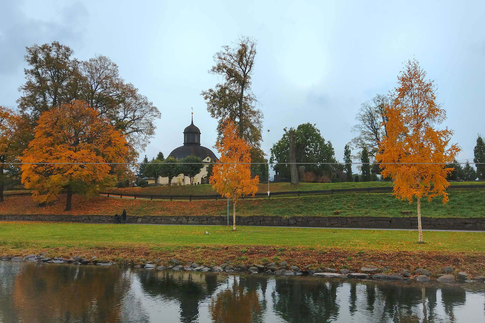
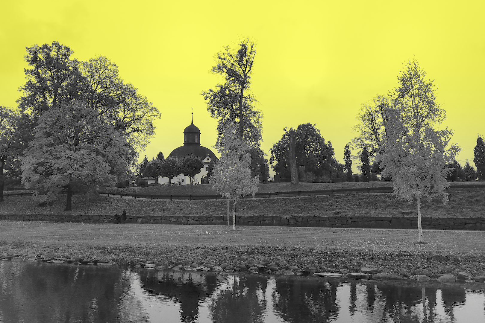
- Click the range button to select a part of the image that should be used to define the range for the currently active sliders (in this example, it's H for hue):

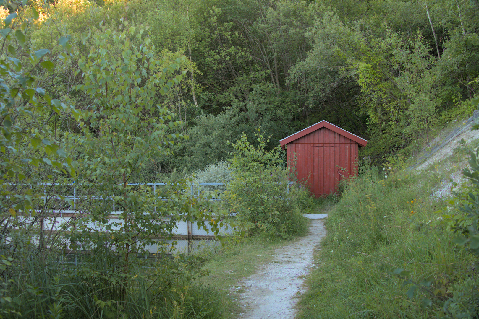
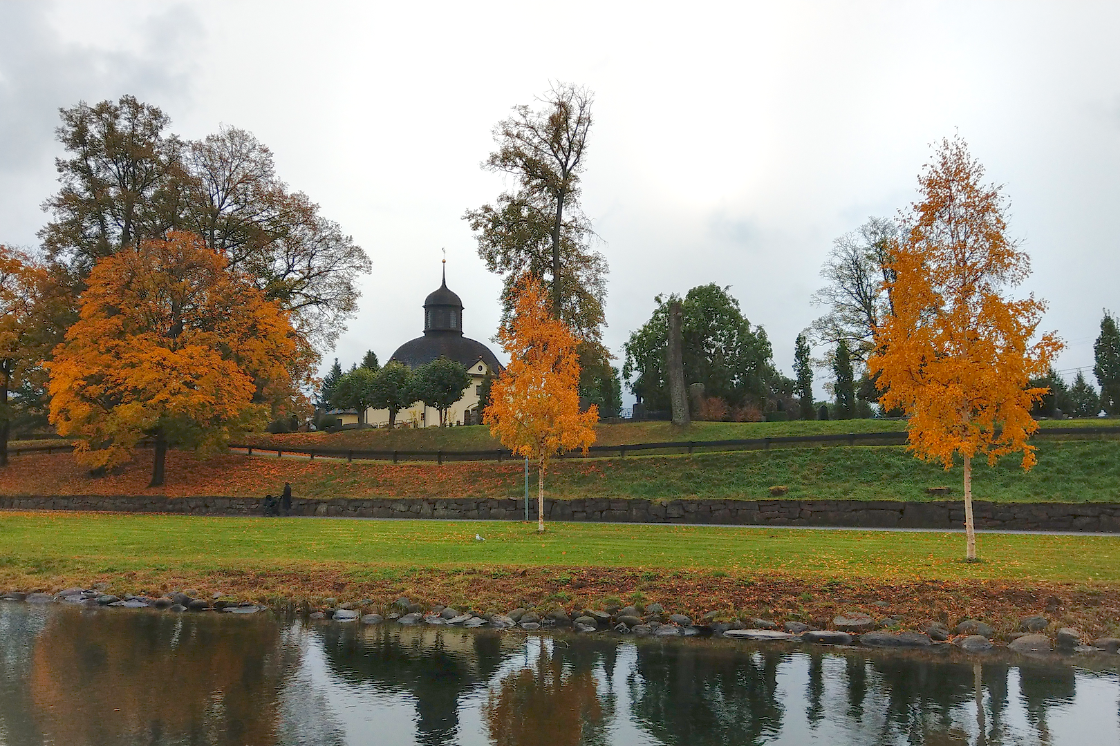
Here you can see an example image, followed by a range selection and the resulting mask on the right:
 |
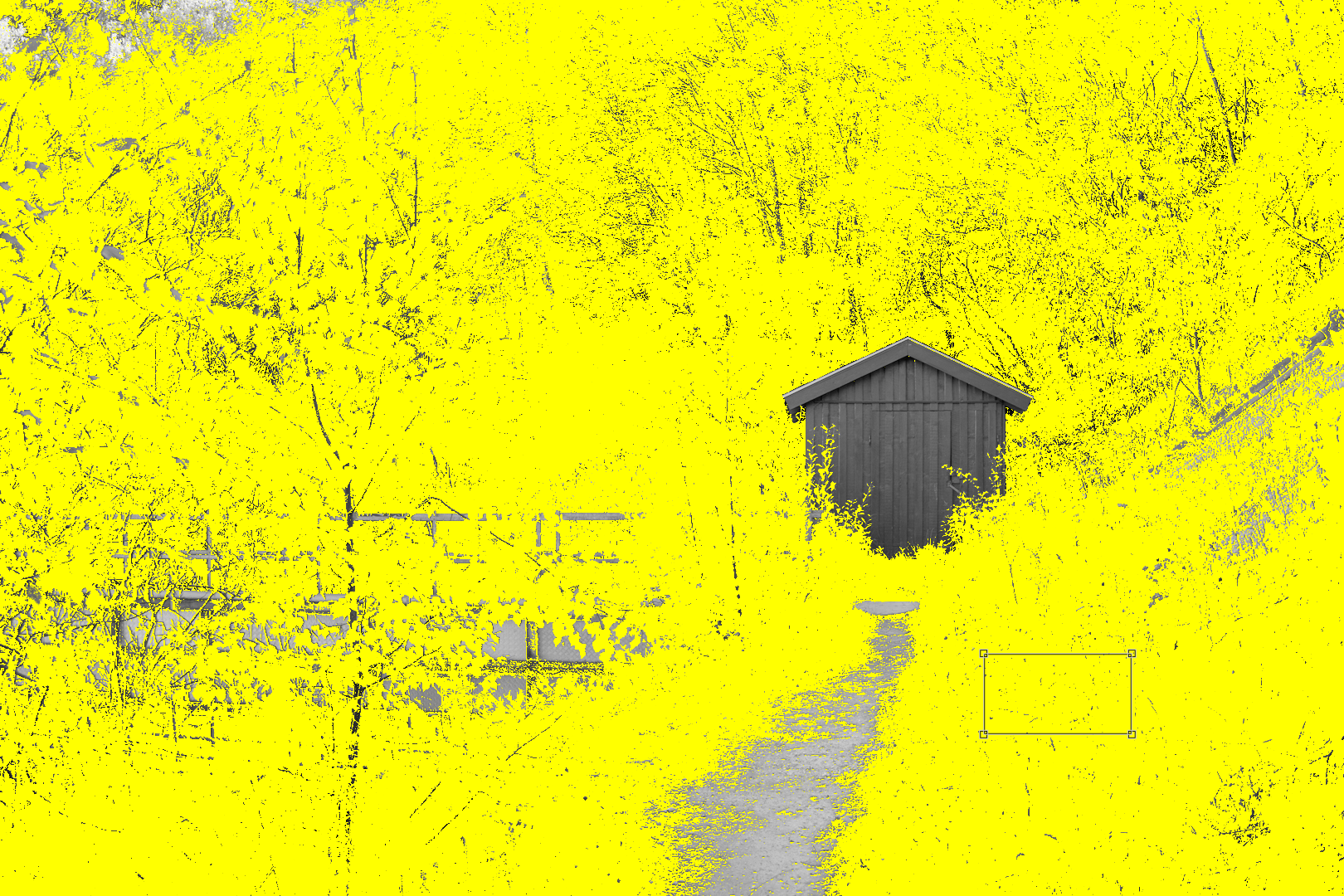 |
I selected a region of green leaves, and all the green parts in the image now show up in yellow (i.e., are included in the mask). It's mostly the hut and the footpath that are left out of the selection.
Practical examples
Here I'm collecting some frequent use cases I have for masks.
Vignetting
Vignetting refers to the effect of "fading out" a picture towards the edges, e.g. by reducing the brightness and saturation, or by increasing the brightness to make the borders fade towards white. This acts like a "frame" around the image and can draw the viewer's attention towards the center.
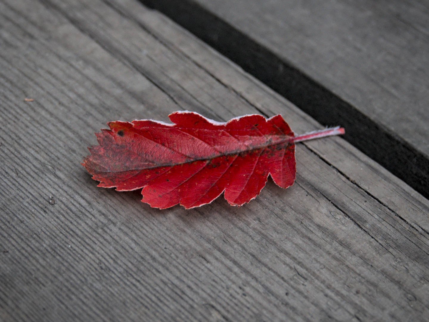
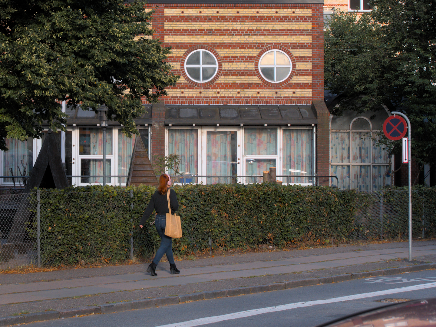
For example, this picture of a leaf has nothing interesting going on except for the subject in the center, so I thought it's a good opportunity for adding a bit of vignetting:
 before before |
|
Adding a vignette is easy:
- I use the basic adjustments module since it allows me to adjust both exposure and saturation at the same time. For the image above, I set the exposure to -0.63 EV and saturation to -0.12, but it really depends on the image and your personal taste.
- Now I just have to define an elliptical mask that covers the whole image except for the edges, then toggle the polarity so that we mask everything outside the ellipsis.
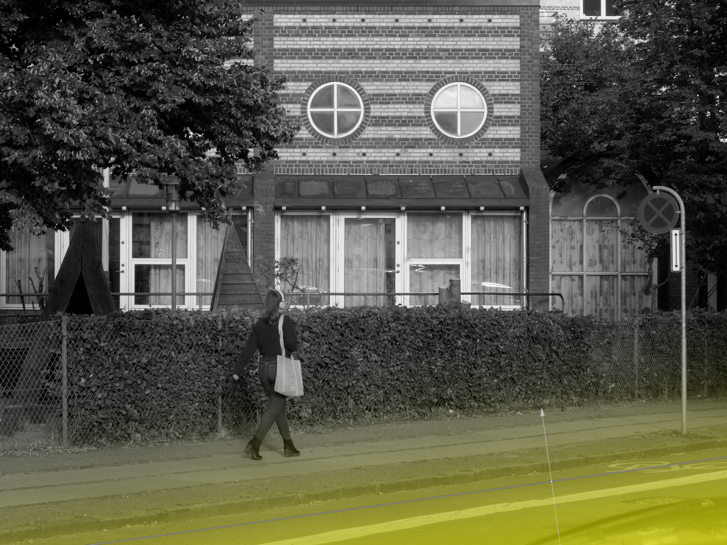
- To make the fading effect softer, I also normally crank up the feathering radius and mask blur. Play around with the sliders while mask display is on to see the effect. Here are the mask settings for the example image:

The resulting mask looks like this:

For a fade-to-white mask (this might look good if the picture itself is already very bright), do the same thing but try to increase the exposure or brightness levels instead.
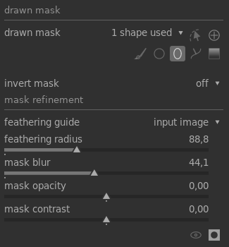
Spot highlights
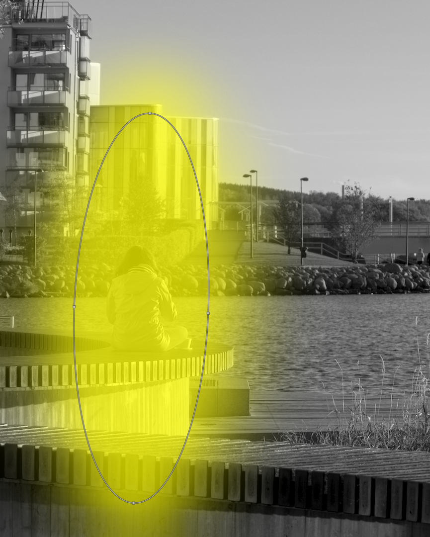
I first noticed this effect in the Lightroom presets by James Popsys, and I don't really know what people call it, but I usually call it "spot" or "highlight" or both. The idea is to subtly emphasize a part of the image where the main subject is or where you want to draw the viewer's attention to. For example, in the following image I put a subtle spot on the person sitting:
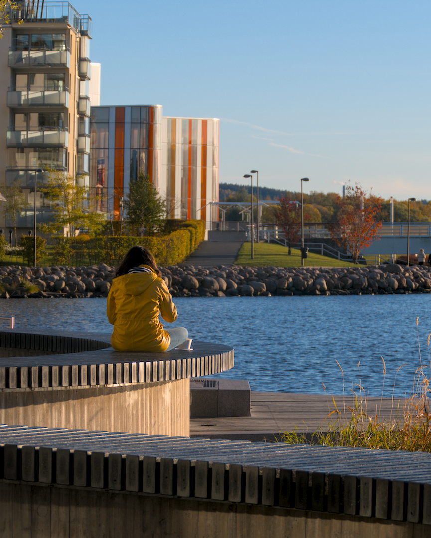 before before |
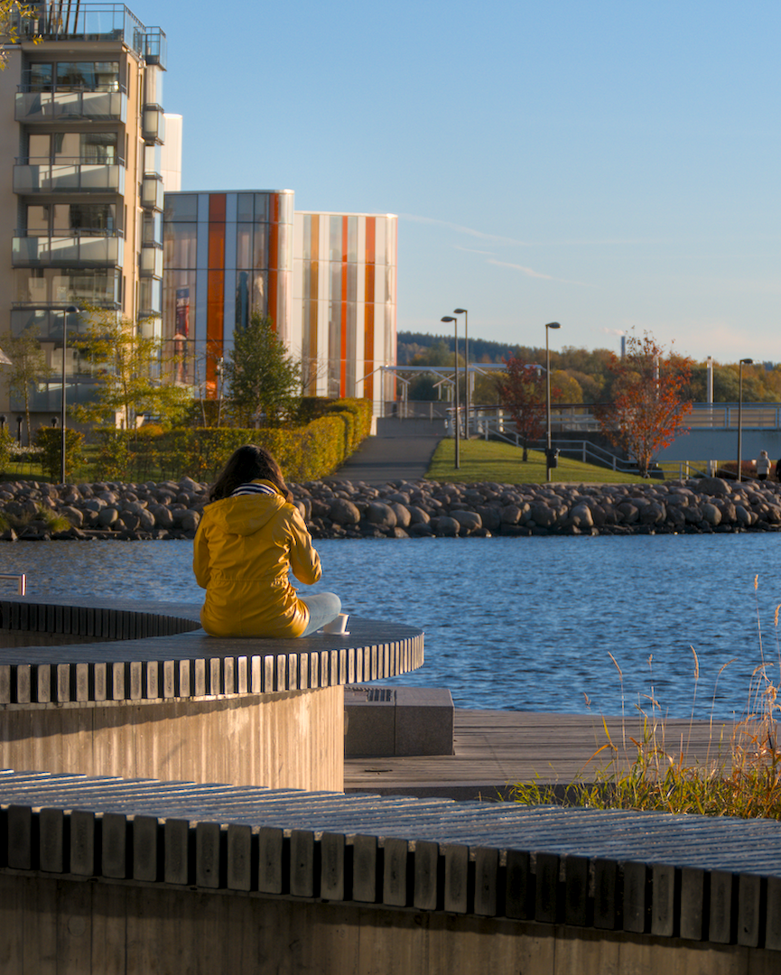 after after |
The idea is quite similar to vignetting: use basic adjustments with an elliptical mask to slightly increase the exposure (rule of thumb: about +0.5 EV; here I used +0.33). Make the ellipsis large and use generous amount of feathering and blurring to get a subtle effect that won't be super obvious in the resulting picture. Here's what the mask looked like:
Additionally, you can try increasing the vibrance/saturation a little bit, or use the contrast equalizer together with the mask you just defined to increase the sharpness in the highlighted region slightly.
Gradients
Another idea quite similar to vignetting is to use gradients to guide the viewer's attention away from one edge of the image. In the following image, I thought the foreground (street and the parked car) was distracting a bit from the rest of the image, so I used a gradient to make it slightly darker:
 before before |
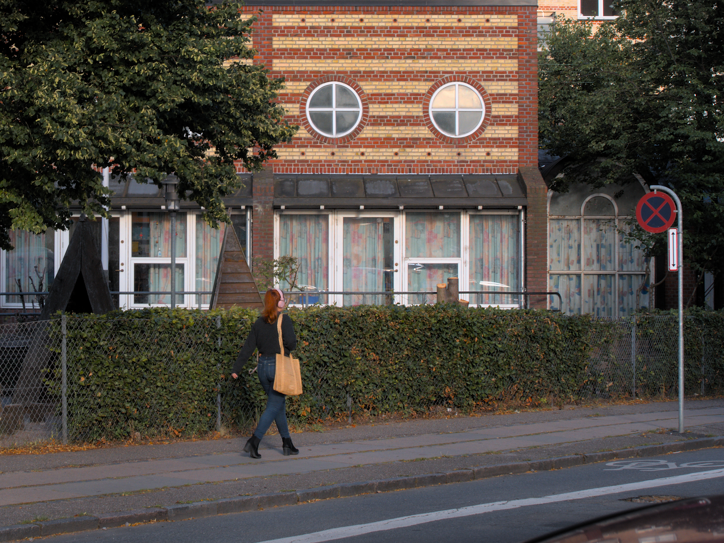 after after |
Again, I use basic adjustments to reduce the exposure and possibly saturation, but this time with a gradient mask like this:
Adjusting the sky
I took the following picture against the sun (behind a cover of clouds), which made the sky look extremely bright and colorless. I thought the image might look more balanced when the sky is darkened a little bit and given a tint of blue:
 before before |
 after after |
(Maybe the blue is a little too strong and artificial, I'm still not sure, but that can be adjusted easily to your liking...)
To achieve this, I used a drawn & parametric mask.
- The parametric part of the mask is used to isolate the sky by masking the brightest parts of the image, like this:

- The drawn part is used to add a gradient so that I only mask the bright parts in the top half (i.e. the sky), and not some of the bright reflections in the water, which I thought looked good the way they were. See the gradient line in the middle of the image here:

The resulting mask looks like this:
I used the color balance module to darken and colorize the sky (but there are certainly other modules that could be used to achieve similar effects here):
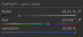
Reducing the factor of the highlights darkens the sky a bit, while increasing the saturation with the hue set to blue gives the colorization effect.