An end-to-end workflow
darktable is a powerful open-source software for photo editing. At its core, it consists of a series of "modules" that can be individually turned on or off for a given picture and provide different editing capabilities. However, different modules sometimes overlap in their functionality, some are only kept for backwards compatibility and not recommended anymore, some work in linear color spaces, others in non-linear ones, and so it can be a bit daunting to figure out what to use.
Overview
I'm mostly trying to work with a scene-referred RGB workflow, which is the preferred way of editing in darktable these days. This workflow can be set as the default in the settings, under processing » auto-apply pixel workflow defaults » set to "scene-referred". It's important to note that this only affects pictures that are imported afterwards, not already imported pictures. To make sure that a picture uses the correct workflow (or to change an existing picture to it):
- The base curve module should be turned off.
- The filmic rgb module should be turned on.
- The exposure module should be turned on and set to the "scene-referred default" preset.
Presets for each module can be found by right-clicking on the module name, or by clicking on the hamburger menu at the very right. Several modules come with pre-defined presets, and you can of course also save your own.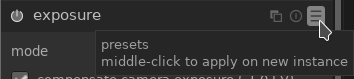
The TL;DR
Here are the steps I try to follow when editing an image:
- Check if I need to activate lens correction, decide if I want to do any perspective correction, then crop and rotate the image the way I think it looks best.
- Check the overall exposure and white balance, then fine-tune further using filmic rgb and/or basic adjustments. I also adjust the global contrast as well as color saturation and vibrance here.
- Adjust the image more creatively and/or improve specific areas. This could involve modifying highlights and shadows with the tone equalizer, manipulating colors with color look up table, or adding spot highlights and vignettes (which I'll describe in a separate article).
- Improve details of the image with local contrast, haze removal, contrast equalizer, and possibly denoise.
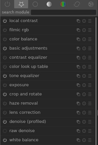
For reference, here are the modules I've currently set as my favorites:
Correcting the image geometry
The first step should usually be to get the geometry, cropping, and perspective of the image to look like it should.
Lens correction
You'll often want to turn on the lens correction module, which corrects distortion and vignetting coming from the lens. The effect will usually be much more pronounced for wide angle lenses, and minimal for tele lenses.
Perspective correction
A bit more advanced and totally optional, the perspective correction module can be used if you photographed something at a slight angle, but would really like it to look as if you photographed it head-on. Clicking the buttons next to "automatic fit" is the easiest way to achieve this. They will make darktable try to detect structural lines in the image and correct them for any horizontal and/or vertical perspective distortion.
Crop and rotate
Use crop and rotate to crop your image down if desired; I like to use fixed aspect ratios (usually 4:3, 3:2, 5:4, or 1:1) but that's a personal choice. The reason to do this early on in the editing process is that it can affect all the following steps; e.g., cropping out an uninteresting dark spot will change the brightness distribution of the image. I'm guilty of also fine-tuning this at the very end sometimes, though...
For rotation, you can right-click and drag a straight line in the image that should be perfectly horizontal or vertical. Useful if the horizon is clearly visible but not horizontal, for example.
If the image is upside down or on the side because the camera didn't correctly detect or save the image orientation, use the orientation module instead to correct this!
Basic image adjustments
Exposure
The exposure module should already be activated, but if the overall exposure of the image is too bright or dark, it makes sense to adjust this now.
White balance
Easy to overlook, the white balance module will be active by default and probably set to whatever value your camera automatically detected to be right. However, it's only an educated guess, and the more challenging the lighting conditions of your picture, the more likely this detected value will be wrong. There are several ways to change this around:
- The first is by just dragging the sliders: dragging the "temperature" slider will adjust the sliders beneath it to achieve a certain overall color temperature; lower values make for colder, blueish images, higher values make for warmer, reddish ones. The "tint" slider will shift the color balance between magenta (to the left) and green (to the right).
- Another option is to change the "preset" settings to "spot" and select an area in the image that is mostly gray. (It could also be a gray card that you specifically photographed for this purpose.) The white balance will adjust towards making the selected area a neutral gray.
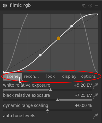
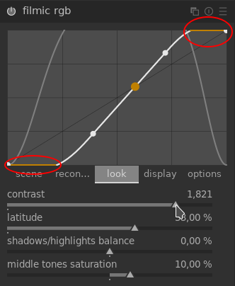
Filmic RGB
Now, this module is a beast. Filmic rgb should already be turned on (as described in the beginning), but a lot of adjustments can be made here. The important thing to note is that unlike most other modules, (i) the curve is just an illustration of the current settings and can't be clicked on or directly interact with, and (ii) the module has different tabs that you can click on to reveal different sliders and options underneath:
For a detailed visual explanation of this module, check out Bruce Williams's episode 067 on Filmic v4 (which is the latest iteration of this module). Also, despite the lengthy description here, I don't actually spend a lot of time in this module in most images...
Hovering over the sliders will usually pop up a tooltip with a brief explanation, but in a nutshell, here's what they do:
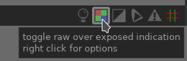
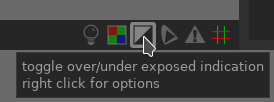
- The scene tab tunes the exposure of the image. The "white relative exposure" slider can be moved around to avoid clipped highlights, i.e., prevent bright areas from getting too bright. The "black relative exposure" slider can be adjusted to prevent dark areas from becoming too dark and losing all detail. A good way to see this is by activating the over/under-exposed indication that can be found in the bottom right corner of the image view:

Activating this will by default color all parts of the image that are under-exposed in blue, and all parts that are over-exposed in red. If this concerns large parts of your image, you might want to adjust these relative exposure sliders!
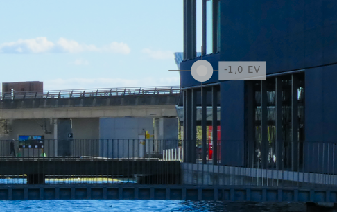
- The recon... tab reconstructs highlights that are already over-exposed in the raw image file; in other words, pixels that are completely white. You can check if you have any of those in your image by activating the raw over-exposed indication:
If you do, this tab can attempt to reconstruct these pixels based on information from the surrounding areas. There is really no better explanation for how to set the sliders than this passage in Bruce Williams's ep 067 starting from minute 13:34.
- The look tab can adjust the contrast of the image (among other things; check out the tooltips!). Increasing the contrast by too much will cause the highlights and/or blacks to get clipped again, the thing that we might just have fixed in the scene tab earlier. If this happens, the ends of the curve will go flat and orange, so you can watch out for this:

- The display and options tabs are not so important for now.

Basic adjustments
The basic adjustments module aims to provide a simple interface to, well, some common and basic adjustments. It does not really offer functionality that can't be achieved with other modules, but can be a simpler alternative to them, and also comes in handy (in my opinion) for many types of edits like adding a vignette (that I'll discuss later).
This module can be used to adjust the exposure (as we could in the exposure module, together with black level correction) or the overall contrast (as we could in filmic rgb, except that here we can't see the clipping in the curve if we increase this too much). It also provides an easy way to adjust the perceived brightness of the image, the saturation of colors, and their vibrance (an adjustment of both saturation and luminance to make colors appear more vivid).
Since this module consists of (mostly) straightforward-ly named sliders, it's best explored by playing around with the various sliders to see what they do.
Creative adjustments
Now comes the fun part! (I hope.) There are many creative or artistic edits that can be done to give an image a certain look, emphasize or de-emphasize parts of an image, etc. Here I'll describe some that seem to work for me.
Tone equalizer
If you need more control over the brightness distribution in the image, e.g., to make skies a bit darker or shadows a bit brighter, the tone equalizer module might just do what you need. It appears to be relatively new, or at least it isn't covered in the official manual yet, so I'm sure I don't know half of what this module can do. But here's a cool feature: if you turn the module on and hover your mouse over your image, you will see a big dot with an exposure indication:
Scrolling with the mouse wheel will now increase/decrease the exposure specifically for regions with this source exposure level. In other words, move the mouse over a particularly dark area and scroll up to make it (and all other parts of the image that are similarly dark) brighter. Move the mouse over the sky and scroll down to make it darker. The module is much more powerful than that, but this is a start.
Color look up table
The color look up table module is a great tool to modify colors in your image for artistic effect. (It doesn't work in RGB space, so strictly speaking it shouldn't be the first choice anymore, but the alternatives seem a lot more complicated to use at this point.)
Its basic premise is that you have a board of color patches which represent source colors in the image, and which can then be individually modified. So if you click, for example, on the bright yellow patch and drag the "green/red" slider towards the reds, bright yellow colors in the image will get an increased red component, making them appear more orange. It's important to note that the module interpolates between the different color patches so that you get a smooth transition between "color ranges".
Now, how to actually use this module in practice? I find that the color checker patch comes in very handy. Activating it will give you a box in your image that you can move around to an area you'd like to modify the color of, and the patch which is the closest fit to that area will be highlighted:
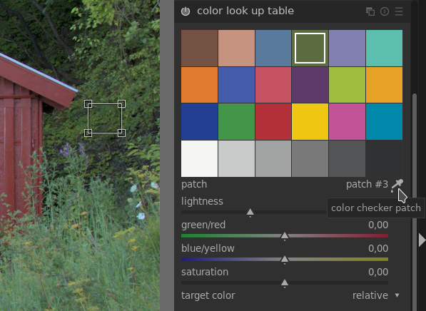 In the screenshot above, the fourth patch in the top row is the closest match to the area of green leaves that are selected in the image.
If the highlighted patch looks quite different from the selected area, or is maybe not specific enough, you can redefine a patch by shift-clicking on it, which will replace its source color with that of your currently selected area. Right-clicking deletes a patch, shift-clicking on an empty spot creates a new one.
Play around with the sliders until you achieve the desired effect. For example, increasing the yellows and reds in the green patches can give an "autumn-like" look to a nature scene. You may have to adjust more than one color patch to get the result you want, or maybe redefine some of the colors.
This module has some cool presets, like "Fuji Velvia emulation", that can be both convenient to achieve a certain look quickly, as well as demonstrate how powerful the module can be and how it can be used.
Adding vignettes or highlights via masks
Masks are possibly the most powerful feature in darktable. Want to change the color of a building with the color lookup table, but not affect the surrounding people? Use a mask! Want to decrease the saturation of a neon sign that's overpowering compared to the rest of the scene? Use a mask! Want to make an image that's black-and-white except for the colorful bike in the foreground? Easy with a mask.
I frequently use masks to add some vignetting to an image or to highlight specific areas that I'd like to draw attention to (or which are just a little bit darker than I'd like), for example. Since masks are so powerful and there's a lot to say about them, I've made a separate page about them.
Further fine-tuning
These steps can be done at any time in the editing process really. All of them are totally optional.
Local contrast
The local contrast module is great for increasing detail, and adding more "depth" to an image. It's not appropriate for every type of photo, but when it is, I find just turning it on with its default settings to be mostly sufficient; I rarely tweak the parameters here.
Contrast equalizer
The contrast equalizer is a really handy module to control details in your image. It provides a lot of useful presets that make fiddling with the curves manually mostly unnecessary. The presets I've found most useful are:
- "Sharpen" or one of the "deblur" presets will add sharpness to the image.
- "Bloom" makes edges look softer and creates a blurry, dreamy effect.
- "Clarity" is another good way to increase details.
The strength of the effect can be controlled with the "mix" slider at the bottom – it's often too strong right after you select a preset, so don't let that discourage you!
Haze removal
The haze removal module sounds very specific: its intended purpose is, as the name says, to reduce the impact of dust and haze in the air that can be particularly noticeable on, e.g., wide-distance landscape shots. Haze makes colors look a bit washed out, so this module essentially boosts color contrast in the image.
Denoise
If you shot in low light and/or with high ISO, chances are your image is a bit noisy. If that's the case and you want to get rid of it, these are the two best options:
- If you're working on a RAW file, use the raw denoise module. As the name suggests, it operates directly on the RAW signal before it is even converted to pixels.
- If the raw denoiser is not enough or you're not working on a RAW file, use the denoise (profiled) module. This usually works really well but can also result in a significantly less sharp image; you can try to fine-tune its parameters (particularly "strength" and "patch size") or maybe even use a mask to apply it only to the particularly noisy parts of the image.